top of page

AZOVO–DONSKAYA OSETROVAYA COMPANY

Упаковка

Упаковка
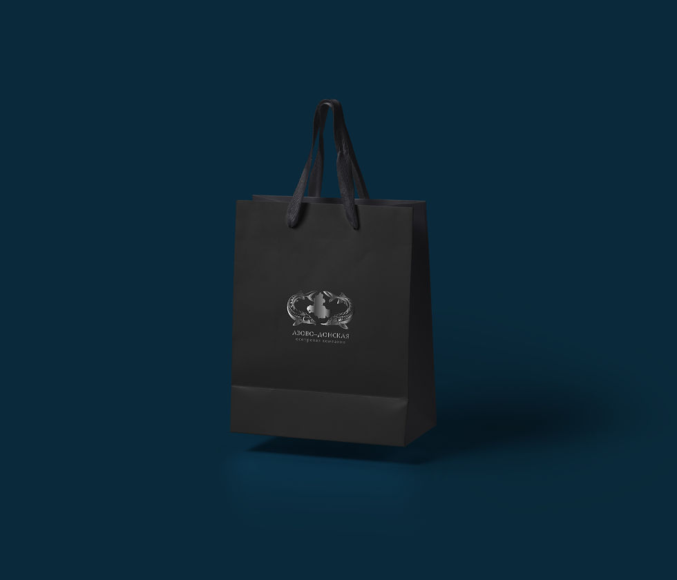
Пакет бумажный
Упаковка
1/6
logo, corporate identity & package
AZOVO–DONSKAYA
OSETROVAYA COMPANY
About project: AZDOK – Azov-Don Sturgeon Company. This is a full-cycle production that develops business in two directions: breeding fish and commodity production.
Objective: Logo rebranding, creating of corporate identity and packaging.
Solution: Use black and silver colors in the corporate identity, where caviar peas and directions of the water flow act as a pattern. The company logo consists of two fish and the geographical location of the fish farm, which collectively recalls the silhouette of the crown, emphasizing the scale of the company.
bottom of page